I designed my personal site from scratch many years ago, and since then it’s undergone plenty of incremental changes. Considering my general lack of artistic ability… the results are probably what you would expect. I recently decided to tweak the CSS styles of my blog’s homepage, since I felt the “recent posts” list was starting to get too dense and hard to read as I added more posts.

This is what it looked like before my redesign. Functional and not terrible, but to me it looked like a boring wall of text with each post stacked on top of each other like this.
The Grid
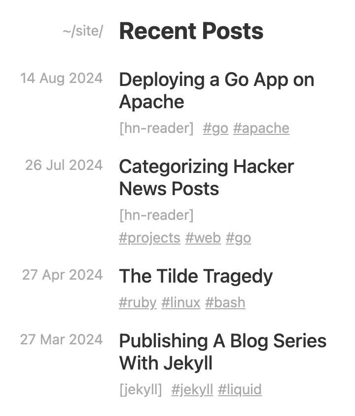
Beyond just moving the non-title text (date and tags) to a line below the title, I wanted to give it a little flair. I had the idea of using a CSS grid layout to put the date in a column to the left, then the title and tags subtext in the right column. On its own, this was fairly straightforward.
<div class="post-links">
    {% for post in site.posts %}
    <div class="post-date">
        <span class="post-subtext">{{ post.date | date_to_string }}</span>
    </div>

    <div class="post">
        <a class="post-link" href="{{ post.url }}">{{ post.title }}</a>
        <div><!-- tags go here --></div>
    </div>
    {% endfor %}
</div>
Beyond some styles for margins, fonts, and color, these are the relevant CSS styles to make this grid work.
.post-links {
    display: grid;
    grid-template-columns: max-content 1fr;
    gap: 1rem 1rem;
}

.post-date {
    text-align: right;
}
This grid-template-columns style sets the size of the two columns in the grid. max-content essentially sets the width for the first column equal to the width of the longest content of any row. The second value of 1fr sets the “growth” factor (similar to flex-grow) to make that column take up the remaining space1.
It looks great!
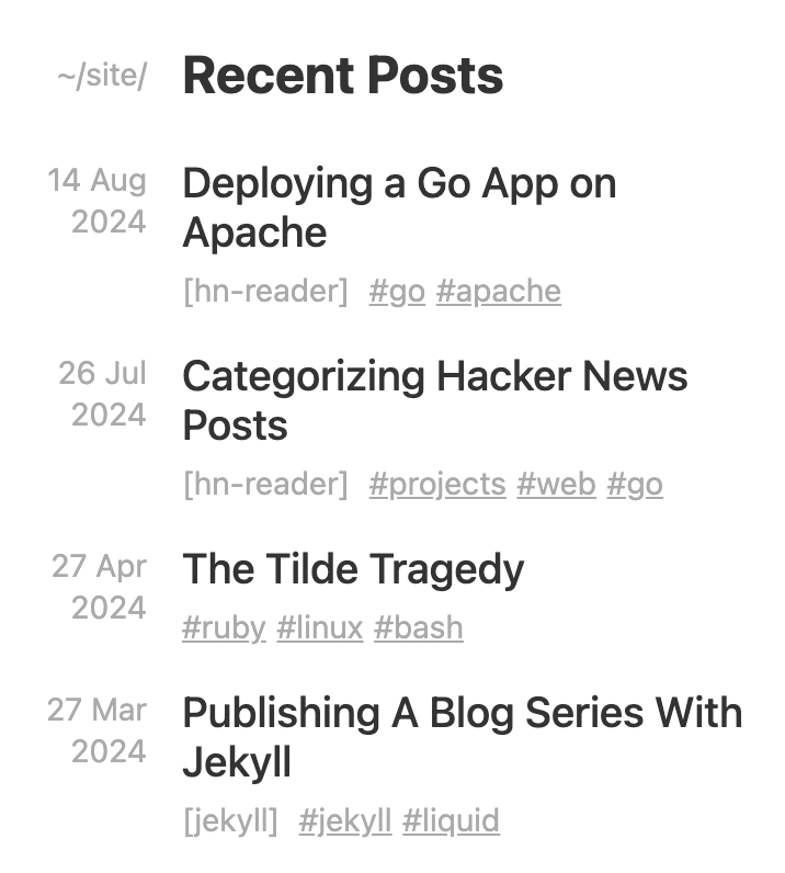
Mobile Compatibility
…on desktop. Unfortunately, because our left column is a fixed size, it can take up ~1/3 of the screen width on certain mobile devices, which squishes the title column and makes things look off balance.
Instead, I’d rather have the left column start wrapping at some point to give the title more space. And I didn’t want to use @media queries, since that felt like a cop-out. Grid only!
Simple minmax()
To make our left column able to shrink and break, we can use minmax() to set a range of widths allowed in the column.
.post-links {
    display: grid;
    grid-template-columns: minmax(0, max-content) 1fr;
}
This works, but with a 0 minimum width, the left column could get really squished. Instead, we can use min-content to make the minimum width equal to the longest word2 in that column, so it’s always at least a reasonable width.
.post-links {
    display: grid;
    grid-template-columns: minmax(min-content, max-content) 1fr;
}
We can simplify this further by using minmax(auto, auto) or even just auto, as these are generally equivalent.
.post-links {
    display: grid;
    grid-template-columns: auto 1fr;
}
If used outside of minmax() notation, auto represents the range between the minimum and maximum described above. This behaves similarly to minmax(min-content,max-content) in most cases.
Better minmax()
While this does cause the date to wrap on very small displays, I noticed that on many larger phones the browser’s grid layout algorithm prioritizes shrinking the right column first, so the left column is still too wide. Ideally we could cap the left column to 20% of the screen (or parent) width. I tried using min() both on its own and within minmax(), but sadly this isn’t supported inside grid-template-columns.
.post-links {
    display: grid;
    grid-template-columns: min(max-content, 20%) 1fr; /* doesn't work! */
}
Instead, we can flip this around. A 20% maximum on the left column is roughly3 the same as an 80% minimum on the right column. So we could use minmax() on the right to let the right column shrink and grow as it pleases, but not smaller than 80%.
.post-links {
    display: grid;
    grid-template-columns: auto minmax(80%, 1fr);
}
As far as our right column is concerned, this minmax() makes it at least 80% wide on smaller displays, forcing the left column to wrap. Beyond that minimum, 1fr allows it to grow to fill the remaining space on large displays after the left column reaches its max width of max-content. Overall this works pretty much how we want!
Alternatively, fit-content()
After spending waaay too long trying to get minmax() to work exactly how I wanted, I read a little more of the CSS grid docs and found an even simpler solution: we could just use fit-content() on the left column. According to MDN, fit-content() essentially does min(max-content, max(min-content, argument)), which is almost exactly what we were looking for earlier with min().
.post-links {
    display: grid;
    grid-template-columns: fit-content(20%) 1fr;
}
Extra Left Padding
One drawback I’ve noticed is that just after the breakpoint where the left column starts wrapping, that column ends up with some extra padding on the left. I haven’t found a way to fix this without totally overhauling it to use some complex flex solution or @media queries, so if anyone has an idea let me know!
-
Any number greater than zero would work here; the number only matters when you have different columns with different growth factors, which allows them to grow at different rates. (return)
-
Technically the “longest unbreakable content” which could be a number, URL, or whatever (return)
-
The
1remcolumn gap makes them not quite equivalent, but it’s close enough for our use case (return)